Article by: geofolkers
Being a fan of an album as a complete piece of art and collecting CDs, vinyl, cassettes and just about anything SP related, I find myself interested in the process of how things came to be. From the artwork, to liner notes, matrix codes, and the people involved, there is an endless story to be told. Recently I had the opportunity to talk “SP” with Greg Sylvester. Greg became involved with The Smashing Pumpkins during the Machina era.
Here’s what he had to say:
I started in music package design by accident. In high school, I’d been interested in pursuing a career in graphic design, but didn’t know what type I wanted to do. I wasn’t interested in designing logos or advertisements, and music packaging—which ended up consuming about 10 years of my life—came about by way of a friend who was in a high school band. He needed a cassette sleeve designed, and so I volunteered myself to do it. I think I was in 10th grade, around 1988. The guy in that band wound up managing a local Chicago west-suburban record store, and when he started a mail order catalog / magazine for the store, I was hired to art direct that publication. Since all of the advertisers in that record store publication were small indie labels, I wound up soliciting the various label owners to let me design CDs for them. And it really just snowballed from there. I joined a friend of mine—who also was designing for small indie labels—and we started a two-person Chicago-based design firm called Kerosene Halo in 1995 (https://en.wikipedia.org/wiki/Kerosene_Halo).
We won a Grammy Award for the design of Madonna’s Ray of Light record in the category of “best recording package” in 1998. Billy found us by way of that Madonna project right as they were half way done recording Machina. Tommy Lipnick, an old friend of Billy’s, was in a restaurant in Chicago around that time. Apparently, the story goes that Tommy made a reference to the restaurant owner that he liked the restaurant’s menu design. The restaurant owner made mention that the design firm that did the work just won a Grammy for a Madonna record, and that they did music packaging primarily. Tommy got in touch with us and arranged a meeting with Billy and his then girlfriend, Yelena Yemchuck (who also photographed the band for Adore, among other things). We all met in our small Bucktown design studio, and Billy and Yelena liked our portfolio, so we got the job. I recall Billy being excited to collaborate on the packaging with Chicago people, as that had largely never been the case during most of the Virgin years.
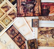
The design collaboration with Billy was without question, the highlight of the package design chapter of my career. Much more so than my time on the Madonna record. All the meetings with Madonna were handled via the label’s in-house art director and her management. We’d never met her. But spending time at Pumpkinland and getting to know Billy and Jimmy (who also became a friend) was pretty special. Most package designers work in a vacuum, isolated from the artist and without access to witness how the music develops. Normally, the designer is handed a copy of the first single, and that singular song becomes the basis for visual development. In the case of Machina, we were brought in right as the news of D’arcy’s departure was making headlines. I believe they were about half-way done tracking. That’s a good time to start to dig in to the visual elements of an album, I’ve found. The main ideas are set, however, there’s still plenty of time for the art to flex to the continued development of the music and lyrics. Yelena brought in the New York-based Russian painter, Vasily Kafanov, who was hired to make all of the complex illustrations and lithographic etchings that comprised the visual aesthetic of the Machina campaign. Billy had communicated the overall structural arrangement of how the thread of alchemy was to complement the Glass and the Ghost Children narrative, but he didn’t go too much in to detail with me. I was able to garner just enough information to begin initial sketching, but with every art status meeting, I was able to glean more of the overall story in aid of shaping the look. I think our incremental approach to design was what left me with such a warm feeling of being part of a true collaboration. I think that we were figuring it out together as the artwork developed. This record was by far the most collaborative assignment I’d ever had as a designer.
I’m proud of this work for many reasons, however, perhaps what comes to mind immediately is that of fine detail. My business partner and I always had an eye for fine detail in our work, but perhaps due to how nuanced and evocative the Machina look grew to become, our need for extraordinary visual detail became entirely compulsive. Billy’s vision for essentially saying goodbye (as this was, at the time, to be the final Pumpkins record) was highly layered and theatrical, so our desire to bake in as much grand detail as possible became endless. Specifically, if one were to remove the actual CD from the CD tray, for example, one would notice what appears to be a slight fade on the paper area underneath the CD (this circular area would be blocked by the opaque CD as it rests in place). My desire to evoke the element of time and what time does with paper and light almost drove me insane. In wanting just the correct amount of faux paper fade, I’d stopped the presses on the printing press several times to make digital adjustments. In the world of album packaging printing, the act of a designer supervising the press run of the packaging art is highly unusual, and asking the pressman to stop the presses in order to make adjustments to the art is essentially unheard of. But there was a desire to tweak and tweak, and then tweak some more. Looking back now after all these years, I’ve concluded that there was a real desire to match, note for note, what Billy was doing as he continually shaped the music. I really wanted him to feel that he was getting the perfect visual match to this masterpiece of a record he was making. I can’t say that I’ve ever worked for another artist in the way I did on Machina in terms of sheer hours, but when people ask me what it was like to work with Billy, I’m reminded as to why I did what I did. I always give the same singular answer: I was impressed by his work ethic. I’d never met anyone else with the same amount of overall vision to create something big, and submitting to the hours of painstaking obligation to make it all come together. He was an inspiring person to be near.
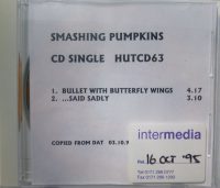
There are two moments that stand out to me as memorable during my time with Billy on Machina. The first is rather funny, to me at least. The Machina era, of course, was pre-iTunes, so the main vehicle for distribution was the CD. And my business partner and I had always presented CD packaging art to artists in the form of an actual CD package. Meaning, we’d print out the art in color, cut it up to CD sleeve size, and essentially put it together in a blank CD plastic tray, just as it would be in the store. Normally, most designers present album art kind of like an architectural blueprint, meaning, just an overall view of all the pages of a booklet, flat, on an oversize sheet of paper. But we felt that the tactile demonstration of opening a CD case, removing the booklet, removing the disc, playing with the various elements, etc., plays a large role to the overall experience. So, during our first real presentation to Billy at Pumpkinland, we just handed him a CD case, not a giant rolled up sheet of paper. And he took it, started to open it, looked right at his manager and said “finally.” And at the time, I was unaware as to what he meant by “finally.” Later, during a chat with his then manager, Melissa, we were told that Billy had always been frustrated by package designers not taking into account the whole experience when presenting art. His declaration of “finally” was wonderful to us, as it really validated the value that I’ve always placed in the tactile experience of creating album art. The second memory that has resonated with me after all these years was probably the nicest sentiment that a client has ever personally expressed. Billy said that we were the first album designers he’d worked with who had truly earned their creative fee. That compliment was a very encouraging way to wrap this project, as it had been a monster assignment for us—a real marathon. We’d been tasked with the creation of everything; the LP, CD, cassette, mini-disc (and foreign language variations of all formats), all single sleeves, radio promo discs, every poster, in-store marketing elements, street wild posting, tour merchandise, all the way down to the backstage pass laminates. We obsessed with every detail on every element and form-factor.
Machina was nominated for a Grammy in the packing category, but ironically lost to Madonna. Later on, I’d been fortunate enough to be asked to help Billy assemble the 25 custom copies of Machina II, as well as participate a bit with filming Zwan in the early days of that incarnation. Overall, the Machina era was an amazing time for me as a creator and as a person. I count Billy and Jimmy as friends, as well as the extended network of Pumpkins people like former manager, Melissa Matuzak, and all around hero, Joe Shanahan. About once a year or so, I’ll listen to the full Machina record, loud, all the way though with no interruption or distraction. What a masterpiece indeed.
Gregory Sylvester
Director


Leave a Reply